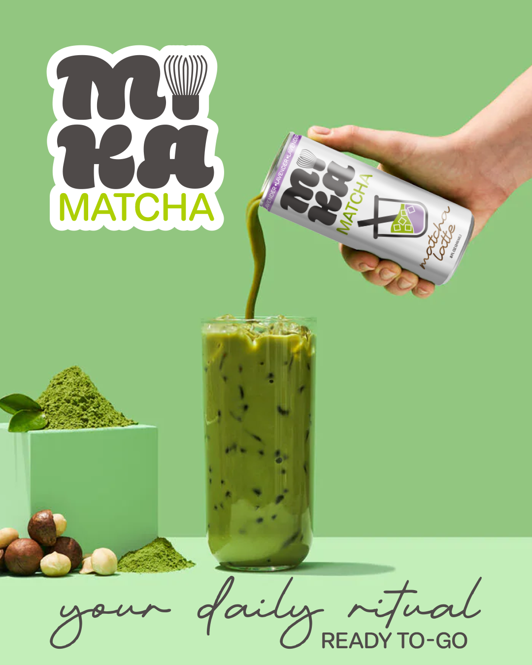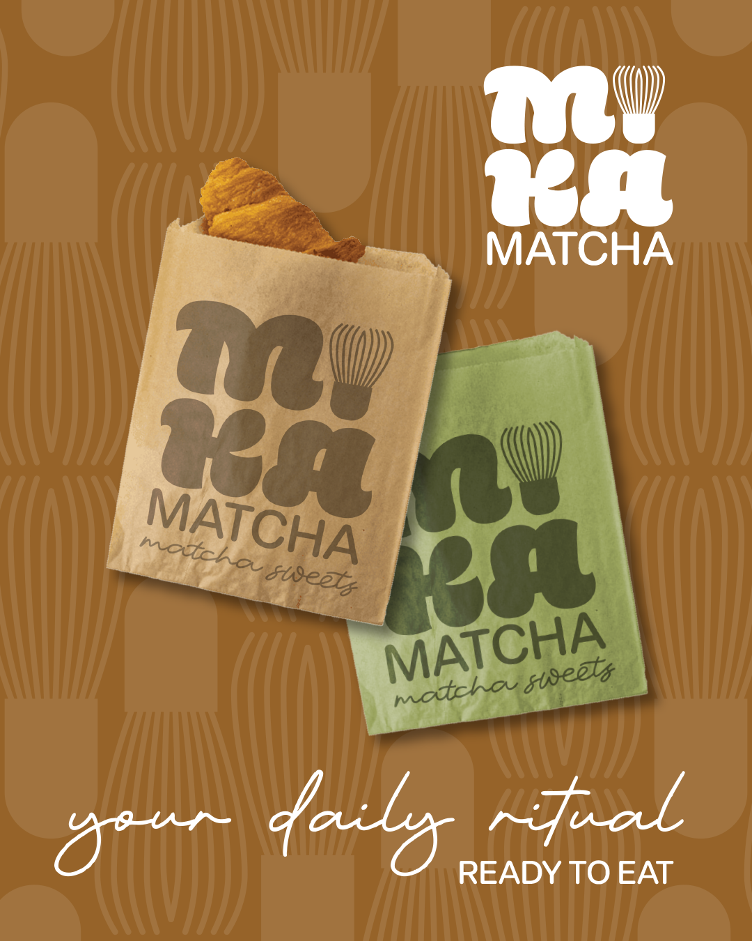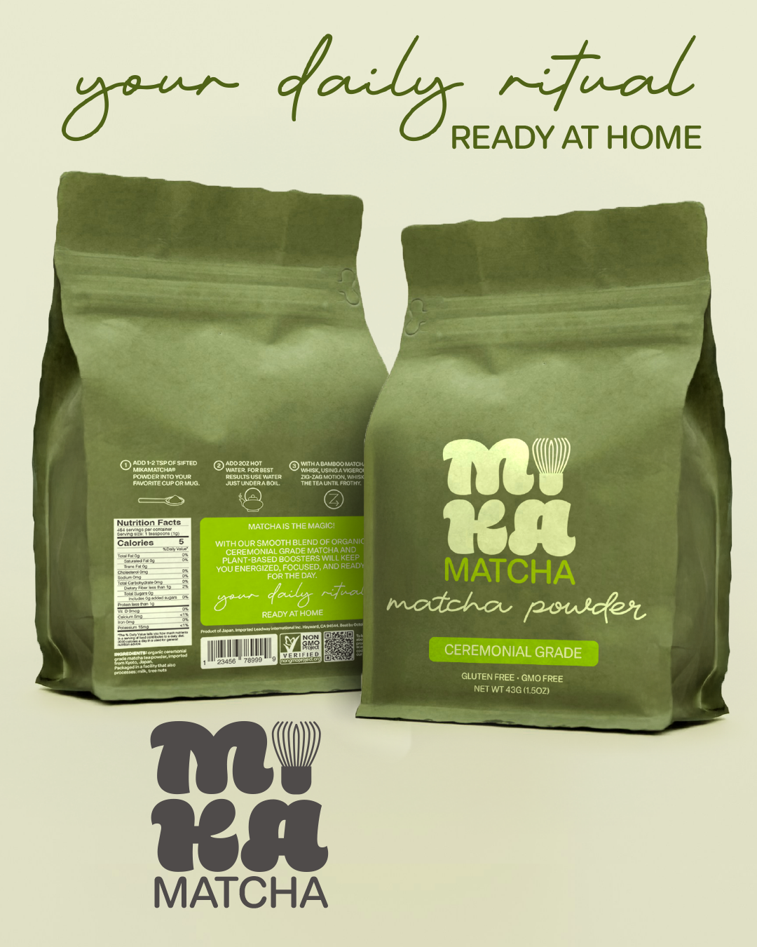
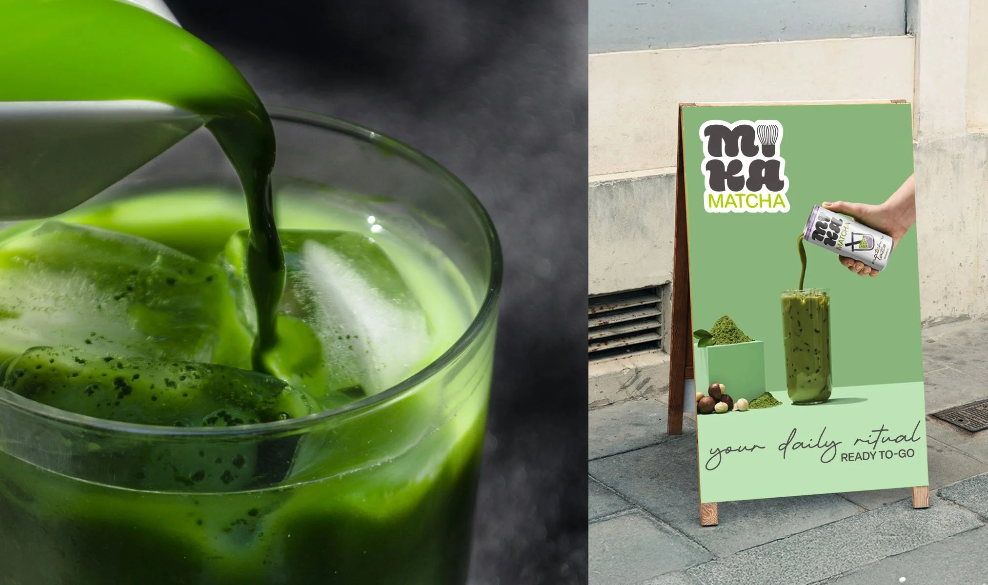
Mika Matcha is matcha drink brand inspired by Japanese tea culture for the modern era — offering on-the-go flavors with high quality ingredients. Sourcing premium organic matcha from Kyoto, Japan packaged in a playful, welcoming, modern style for connection, recharging, and creative moments. The goal was to create a brand identity that balances authenticity with modern charm—showcasing high-quality matcha while appealing to a global, design-conscious audience. The challenge was to merge tradition with a fresh, energetic feel. Crafting a vibrant identity that blends clean, modern design with whimsical illustrations. A bold logo, signature green, and a cheerful matcha-brewing character bring warmth and personality. Applied across all touch points; from packaging to digital, the brand feels playful, refined, and unmistakable.
Brand Identity
-
Visual Identity
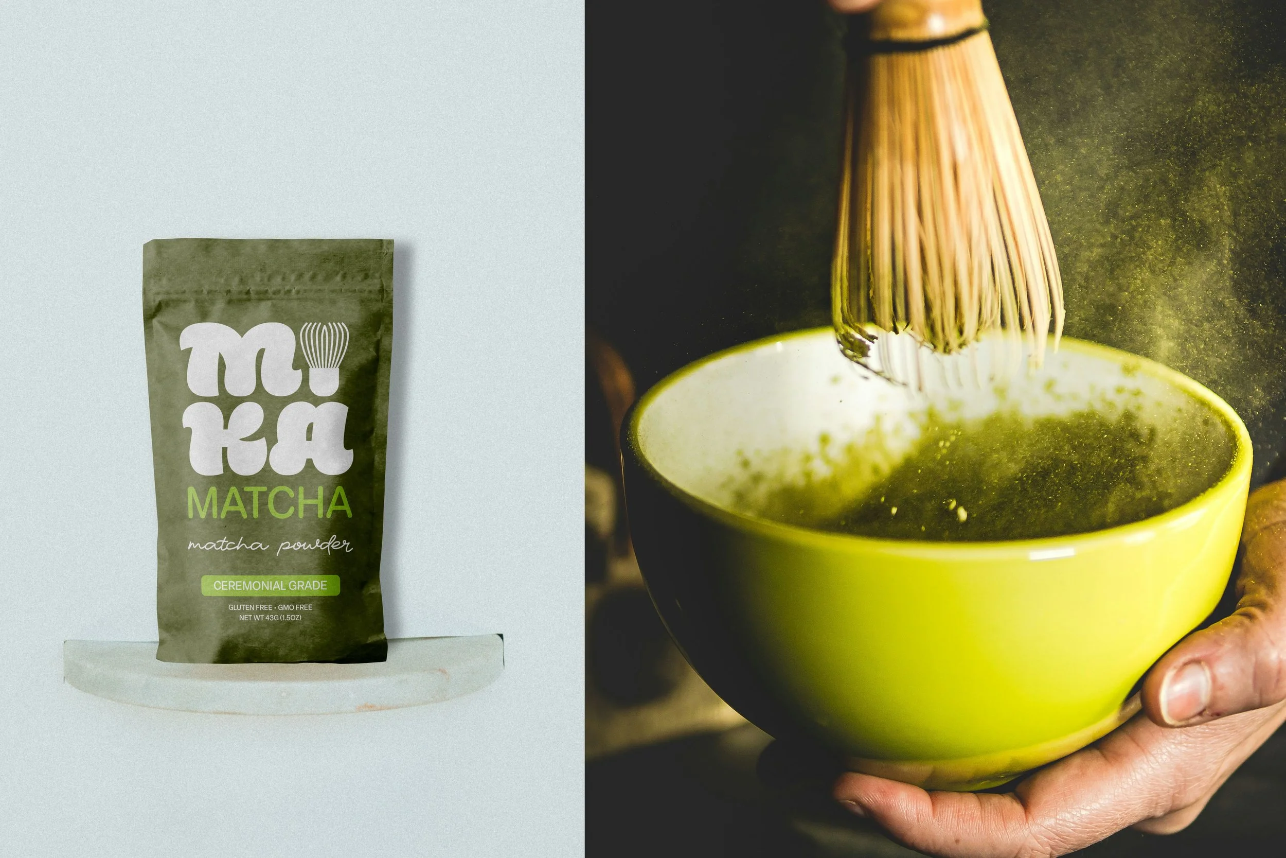
The core brand color is a earthy green. It references fresh tea leaves harvested at their ripest stage and at the same time conveys the depth, intensity, and brightness of matcha powder. This color makes the brand stand out in retail and remain highly recognizable among neutral matcha identities.
-
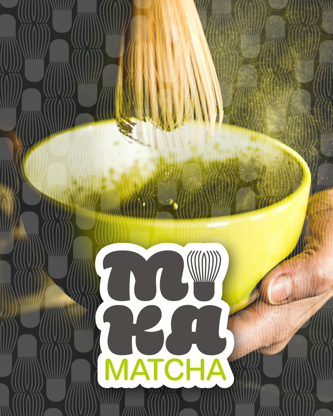
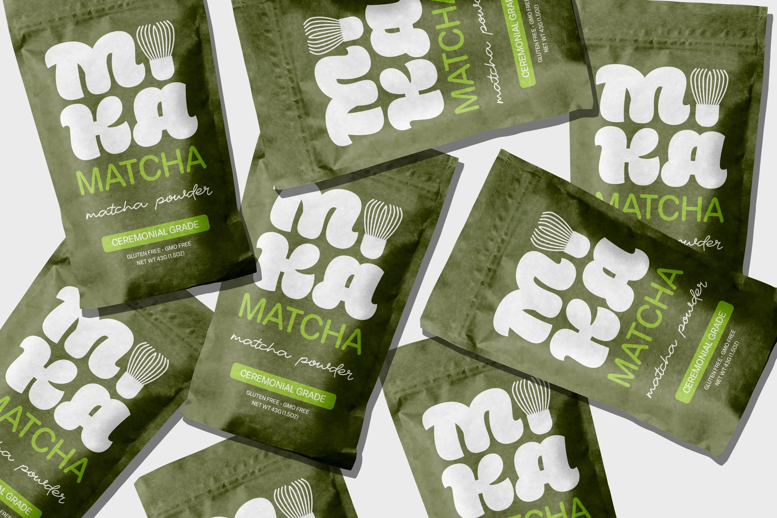
The Logo
The Mika Matcha logo is minimalist and inspired by the ceremonial matcha brewing process. It deliberately avoids stereotypical trends and instead focuses on modern typography. The logo references the tea making tradition by using the matcha whisk as the letter “I” in Mika.
-
Overall Strategy
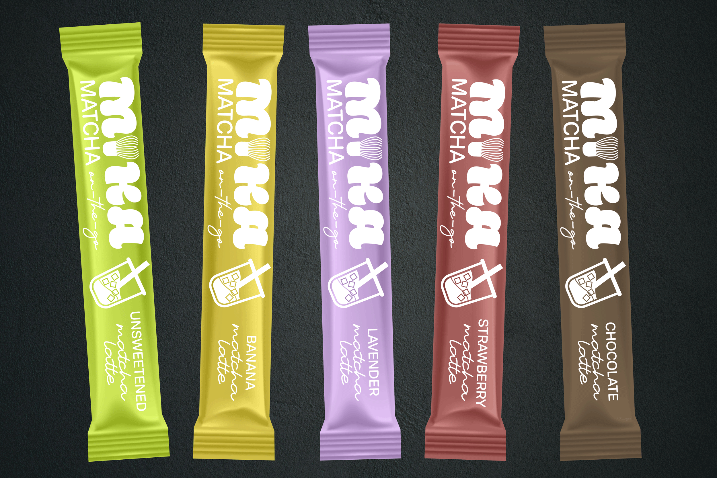
Made for those who crave pure ingredients and a smooth caffeine lift without the crash. Our ready-to-drink, plant-based lattes are sugar-free and infused with adaptogens for calm, focused energy. Flavors include strawberry, lavender, banana, and chocolate; functional, flavorful, and creatively crafted.